Transparent Financial Services For The Long Run

Transparent Financial Services For The Long Run

Fairway Asset Management
My Scope of Work

Visual Identity

Project Management

Positioning

Logo Design

Print Materials

Brand Manual

Templates

PPT Presentation

Web Design

Collaboration

Sibylle Huber

The Communication Butler

Markus Brütsch

About the Client

Fairway Asset Management is an open-minded team of professionals specialised in asset management for private individuals and investment funds. The goal of the new branding was to bring freshness with a more dynamic and modern visual identity while maintaining the professionalism essential to their industry. Key priorities included communicating their transparent approach, as well as reinforcing the brand's values of strong relationships with clients, trustworthiness and long-term investment expertise. With the entire team actively involved in the decision-making process, we carefully considered their feedback and ensured the design aligned with their collective vision and individual preferences.

Fairway Asset Management is an open-minded team of professionals specialised in asset management for private individuals and investment funds. The goal of the new branding was to bring freshness with a more dynamic and modern visual identity while maintaining the professionalism essential to their industry. Key priorities included communicating their transparent approach, as well as reinforcing the brand's values of strong relationships with clients, trustworthiness and long-term investment expertise. With the entire team actively involved in the decision-making process, we carefully considered their feedback and ensured the design aligned with their collective vision and individual preferences.

The Solution

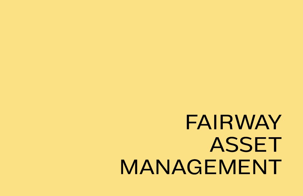
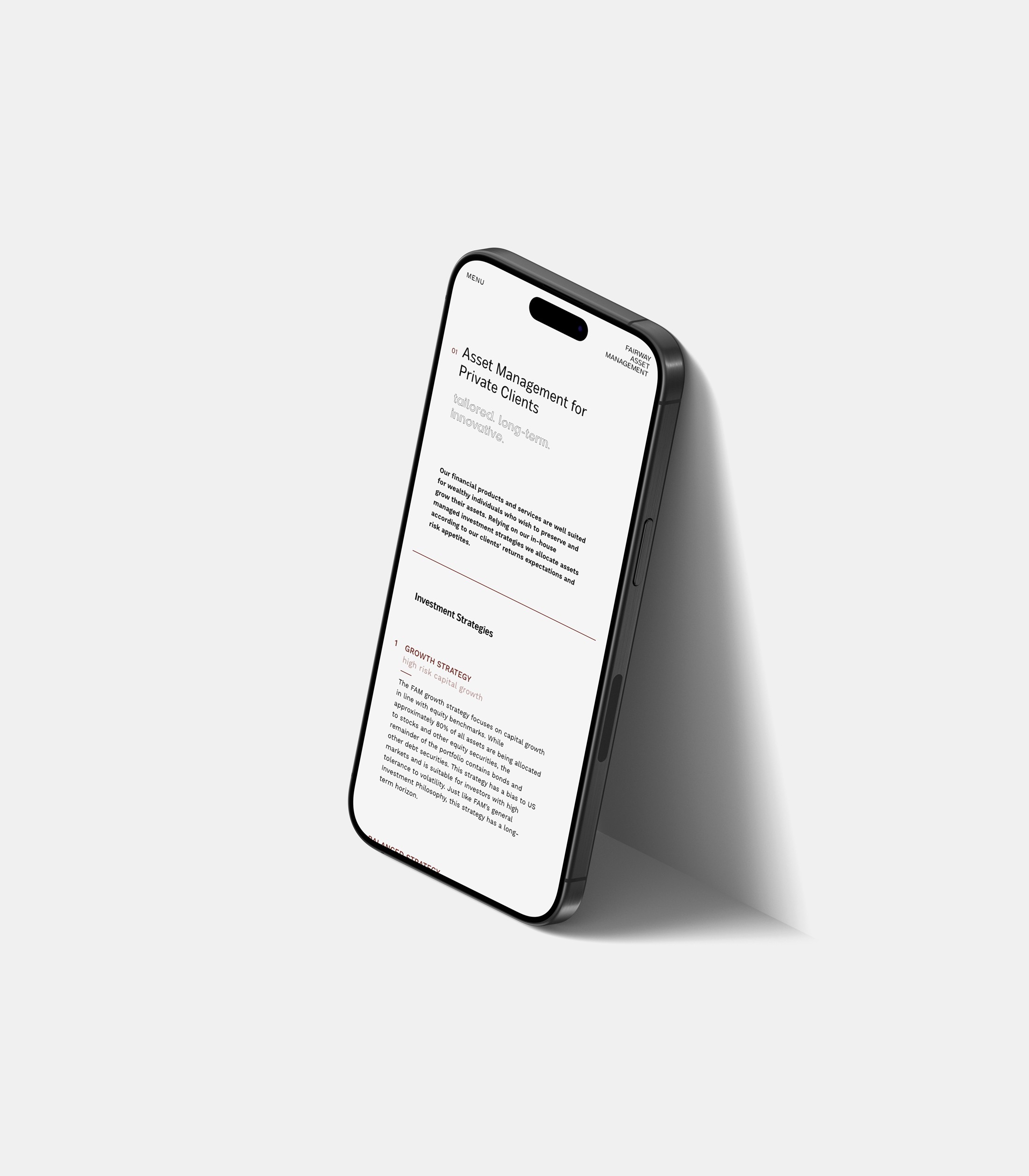
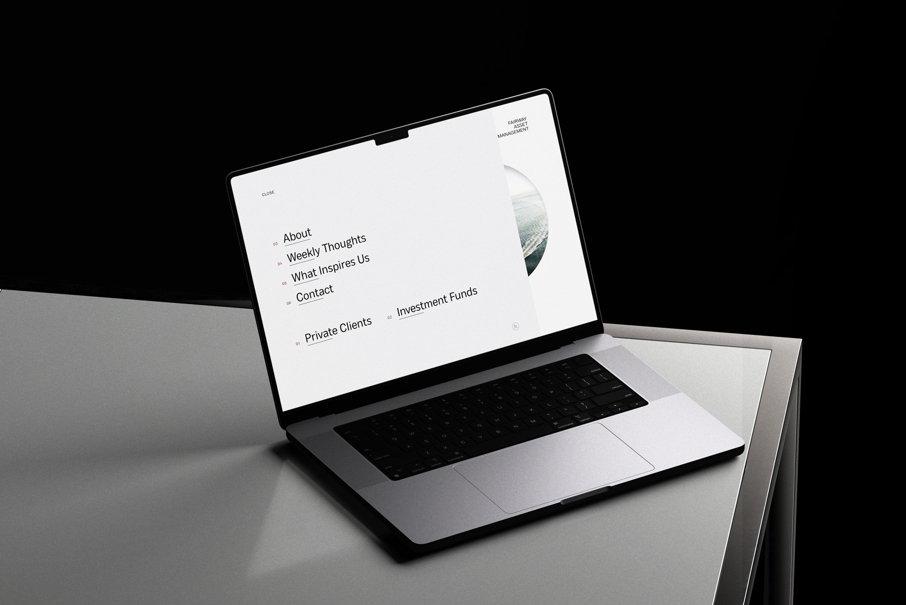
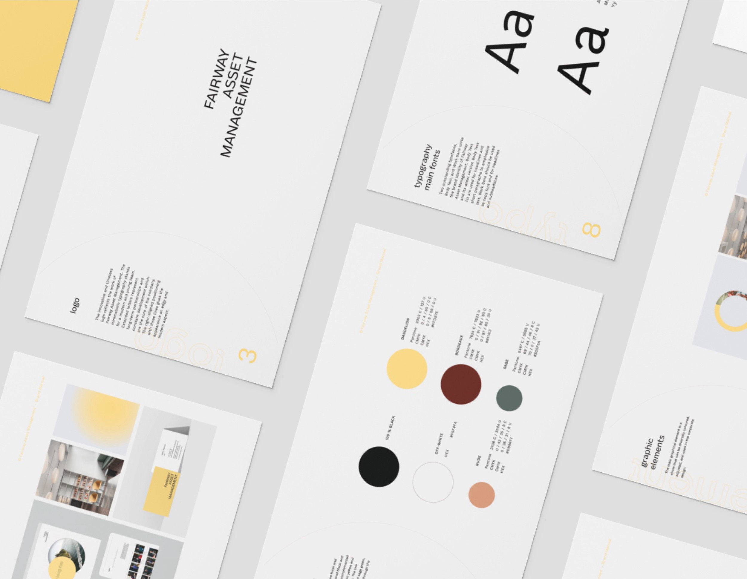
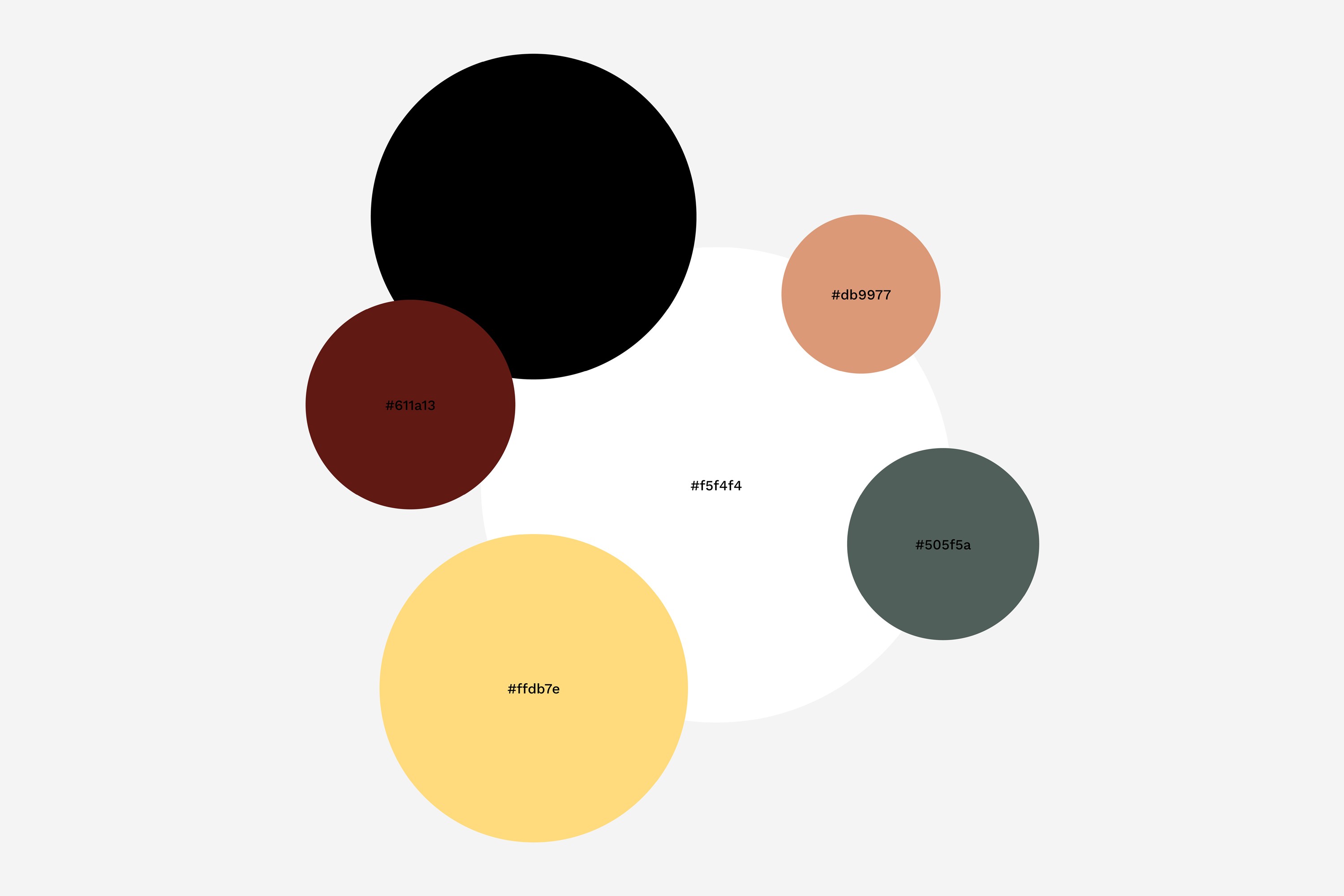
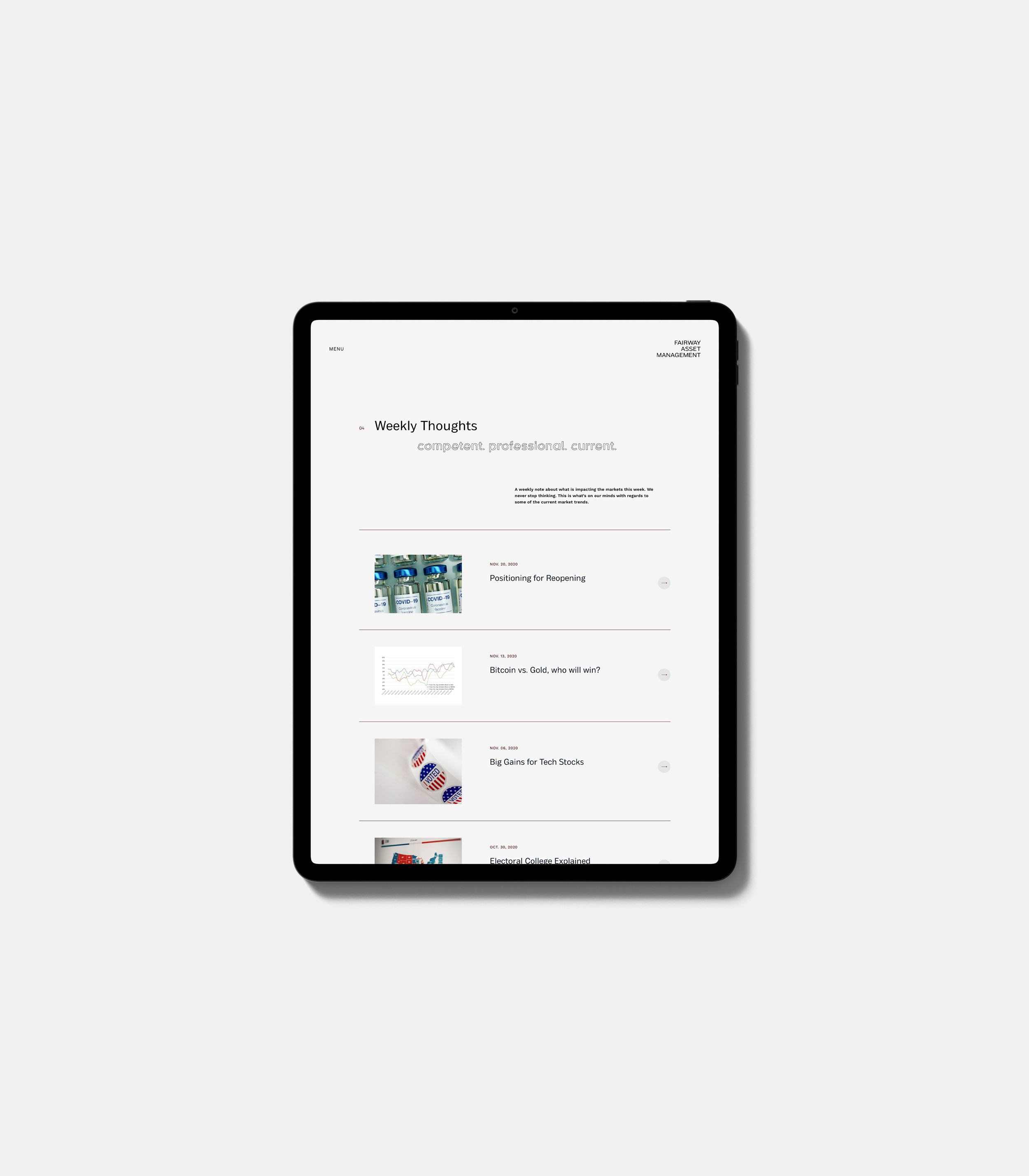
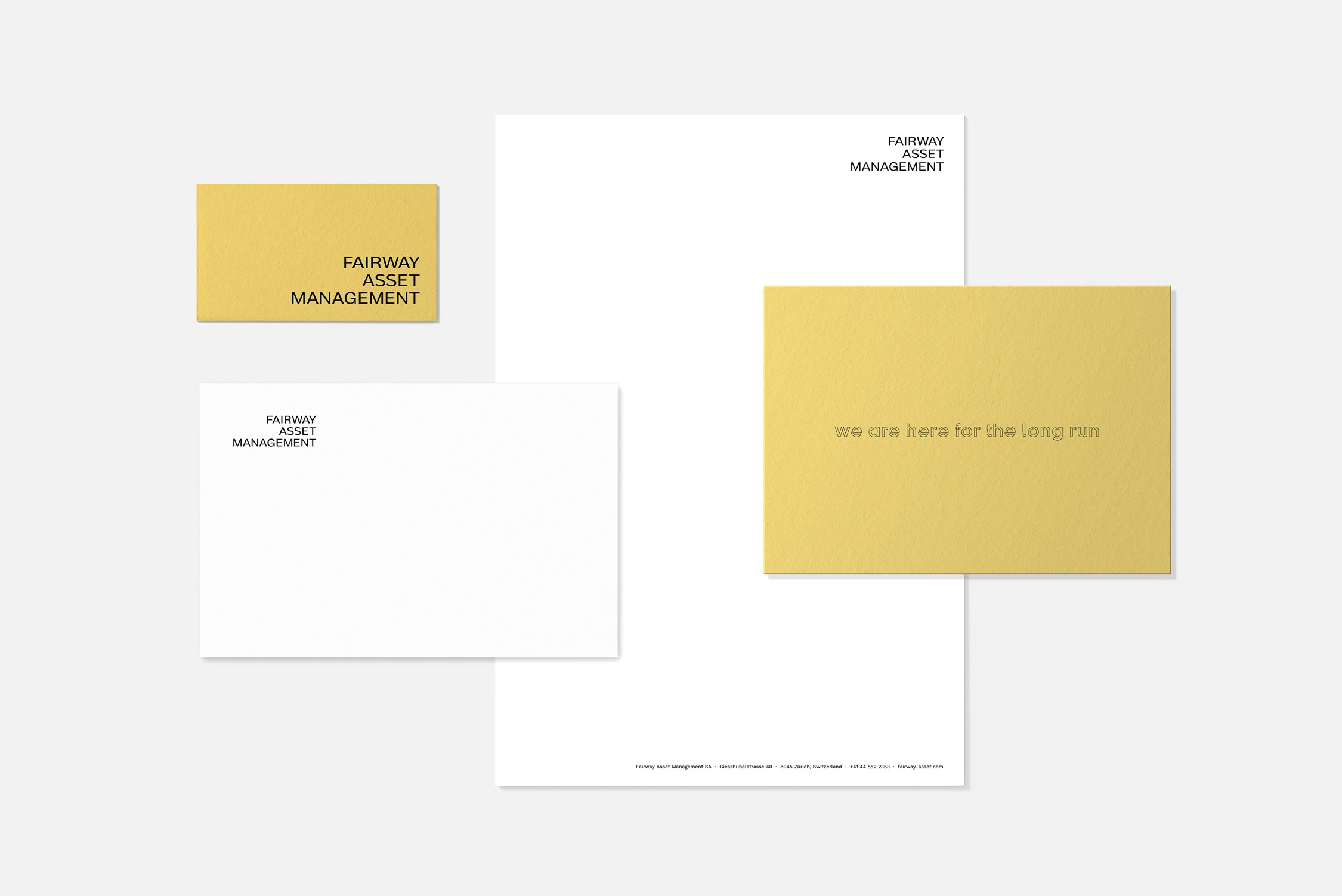
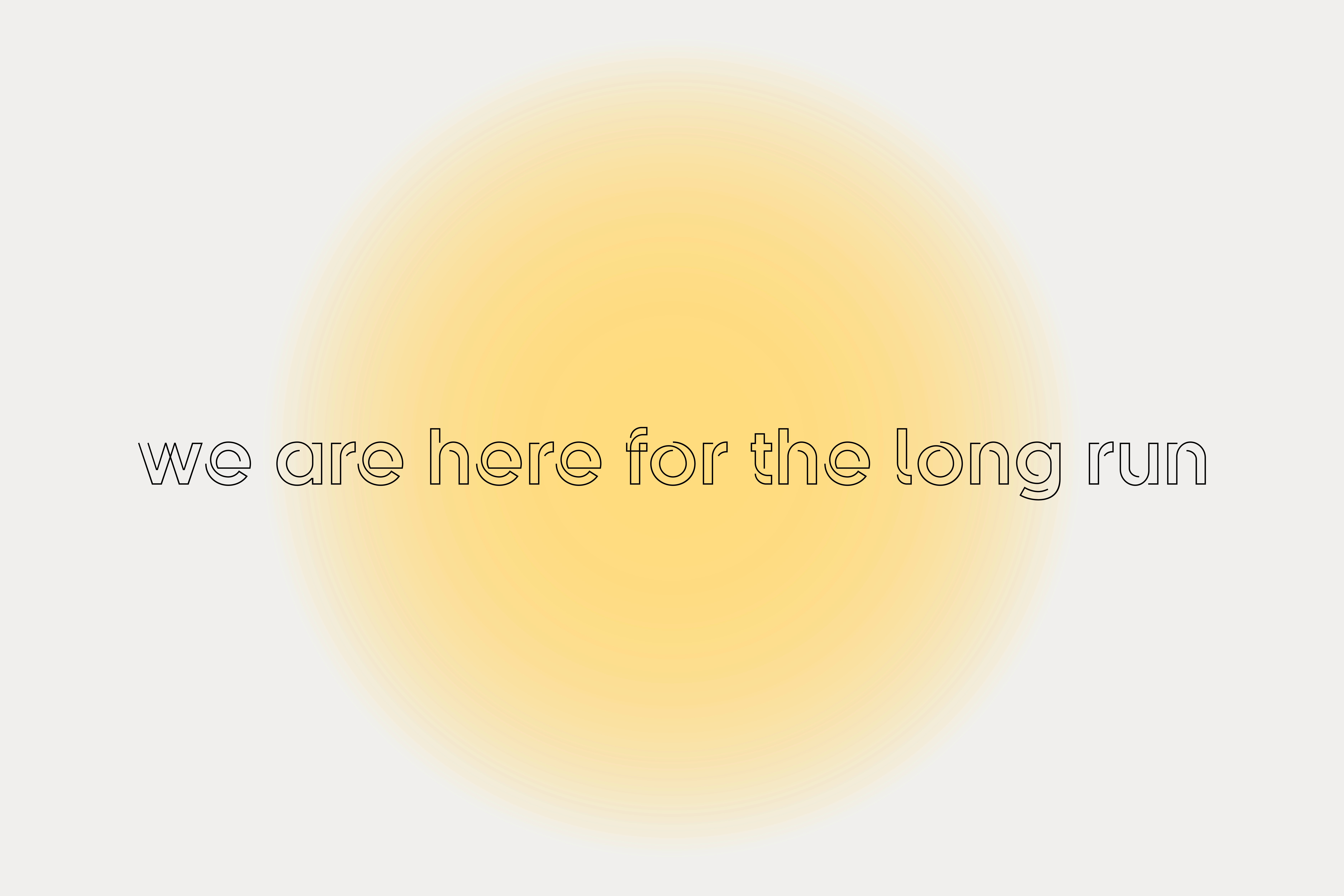
"A bright circle with open minds", a slogan representing the new brand identity. Strong relationships as the most valuable aspect of FAM became the main idea behind the new branding. "We are here for the long run" is the new slogan stating that Fairway Asset Management is a long-term, reliable partner. The minimalistic logo with an exceptional right-alignment reflects a young, open-minded and professional team. A timeless combination of black and white is complemented by a fresh yellow, an elegant bordeaux and sustainable green colour. The circle as the main graphic element is used in two variations, blurred and sharp, which is clarified through the slogan "The future might be blurry but our focus is clear“. The sophisticated yet simple web design provides a clear navigation and unique features like the sections Weekly Thoughts or What Inspires Us.