gooods.
My Scope of Work
Naming
Brand Identity
Logo Design
Packaging Design
Patterns
Signage
Web Design
Brand Manual
Project Management
Art Direction
Collaboration
Sibylle Huber
Markus Brütsch
(created as Brand Designer at Studio Frey AG)
About the Client
The Solution
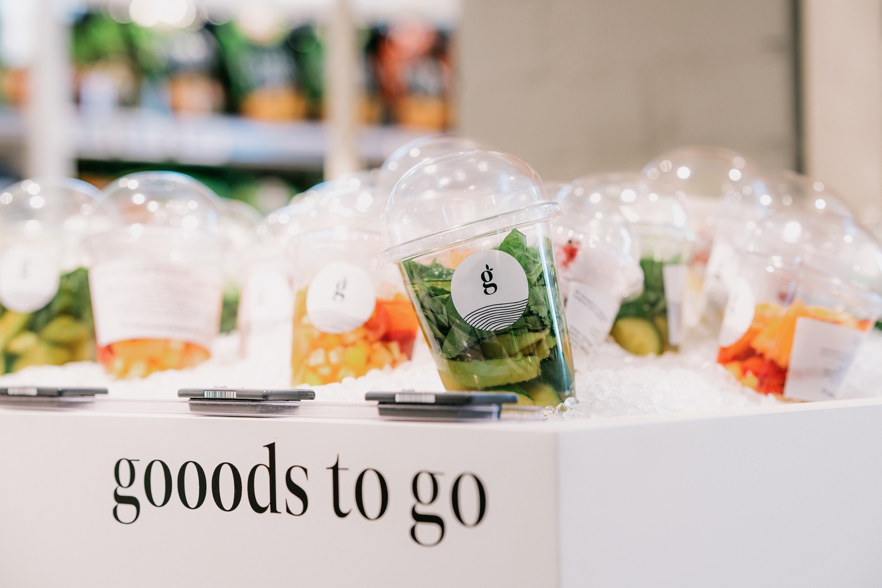
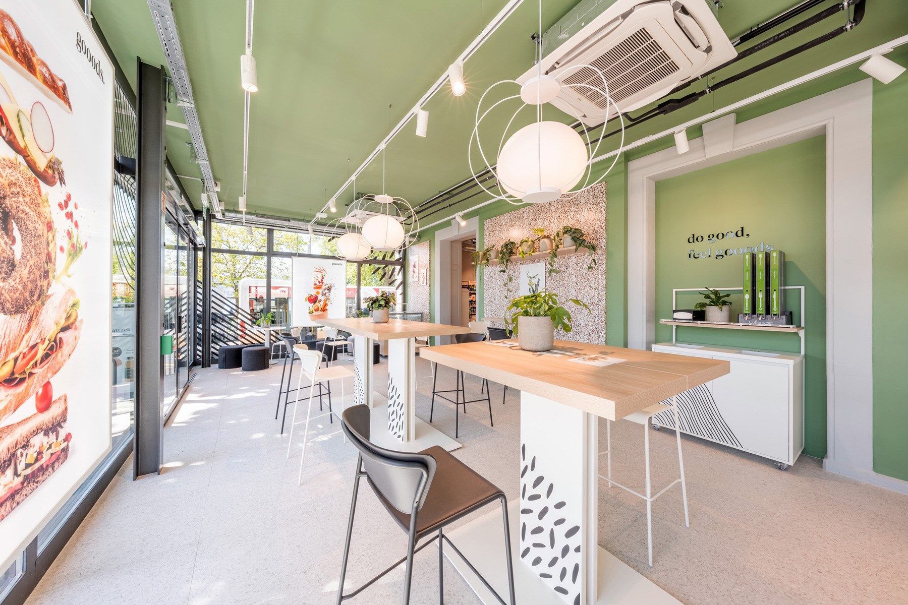
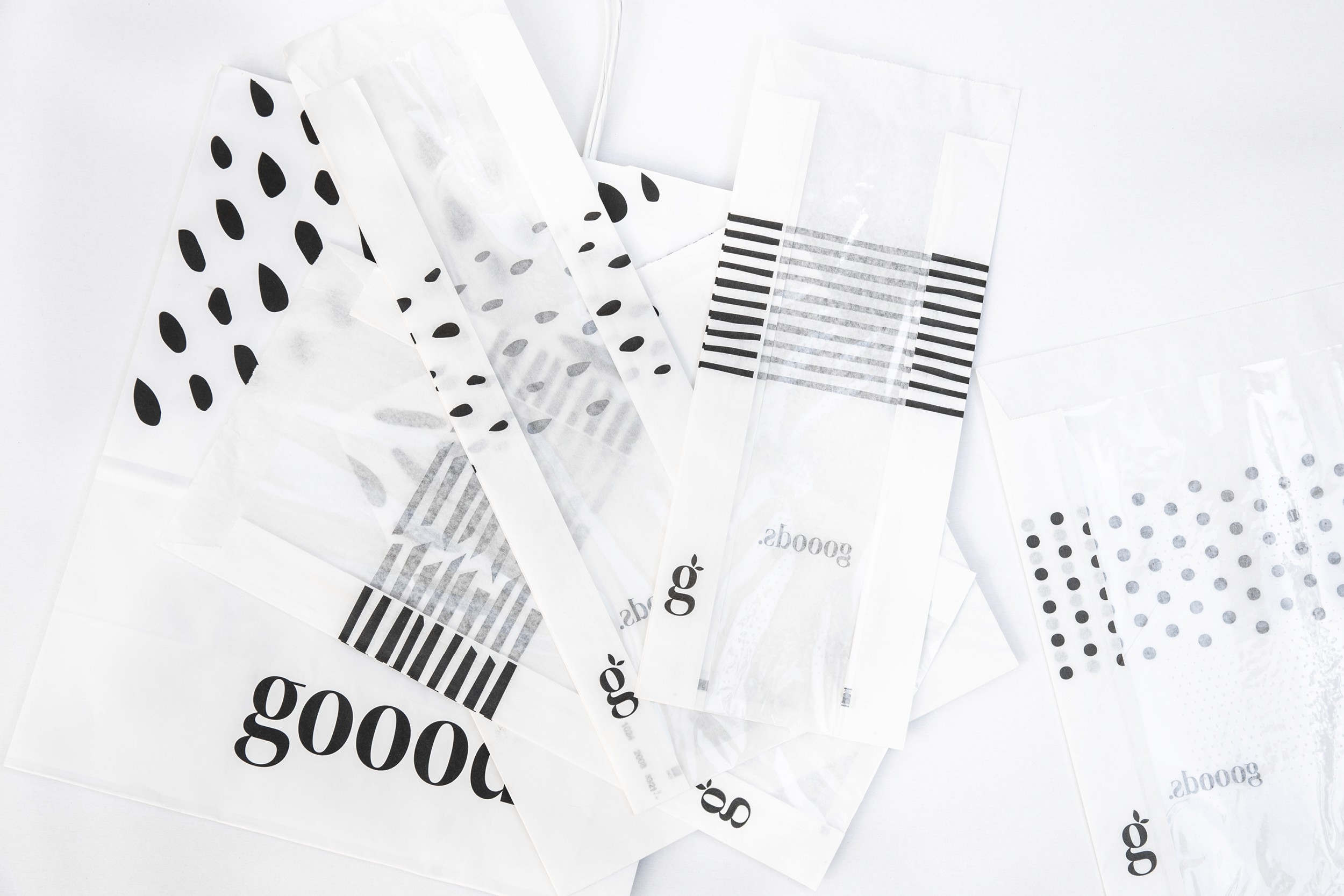
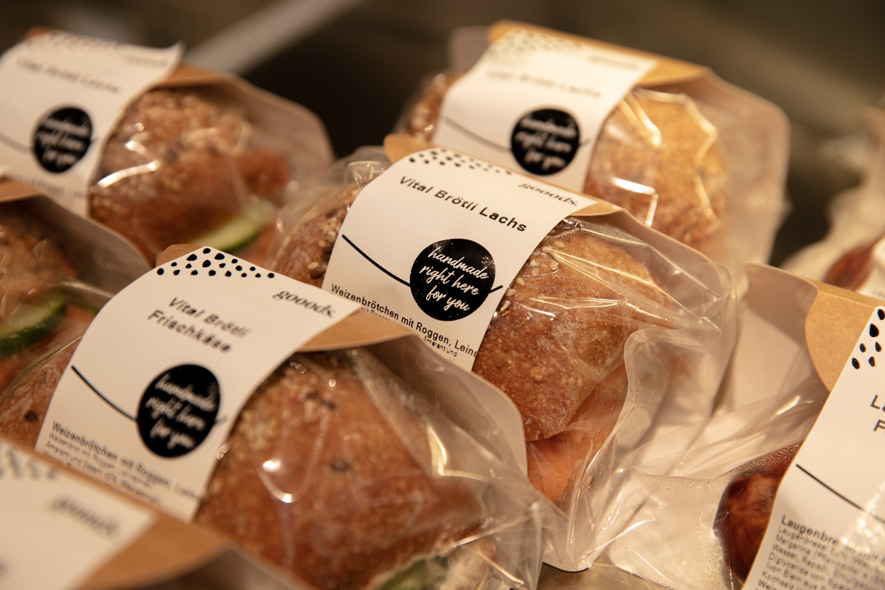
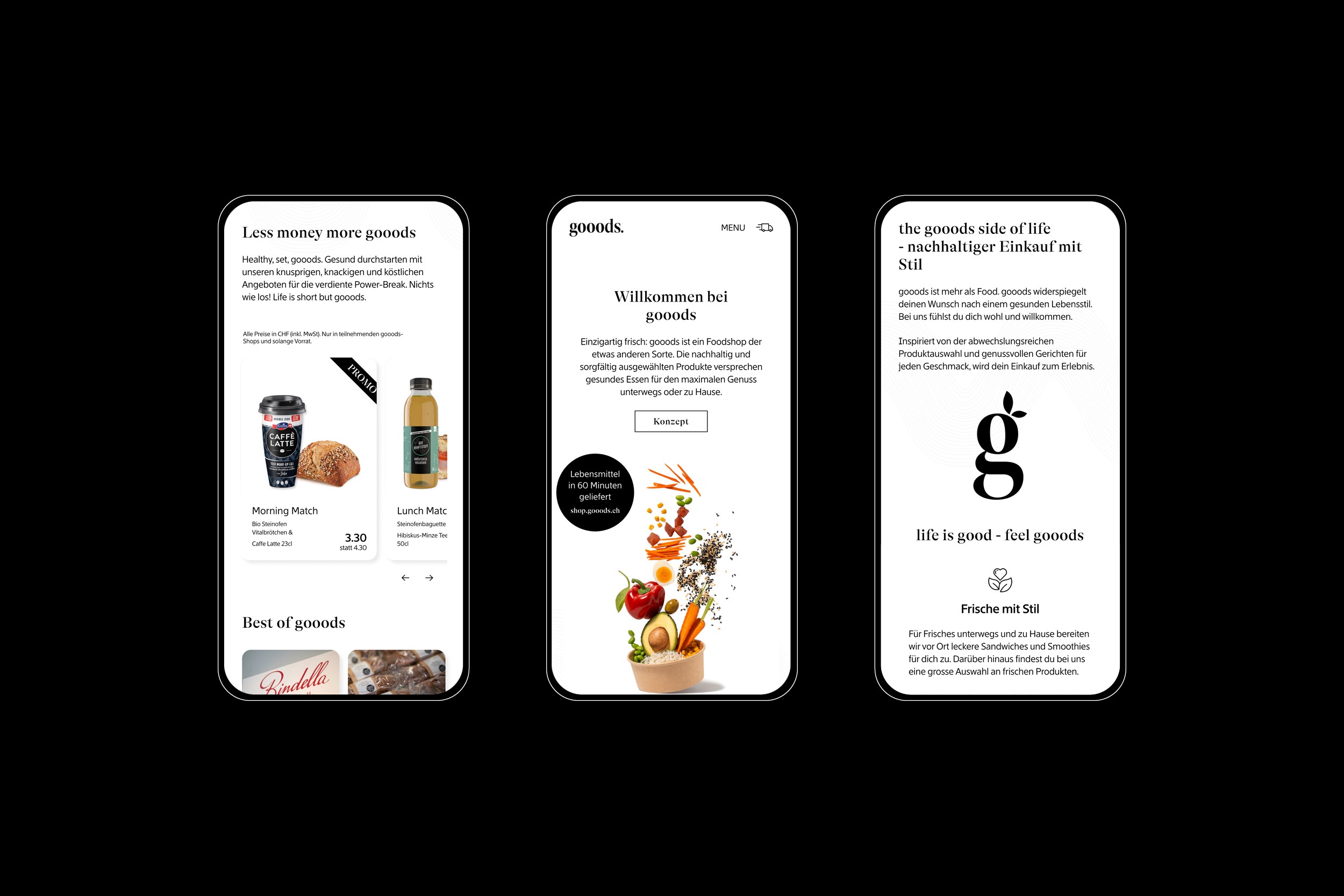
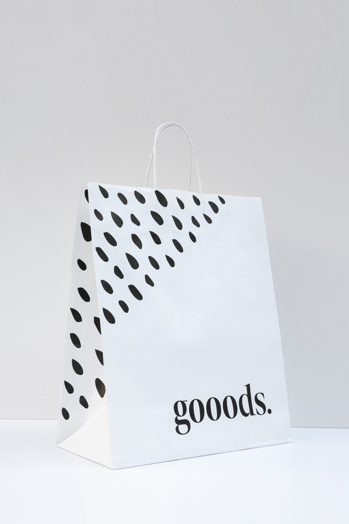
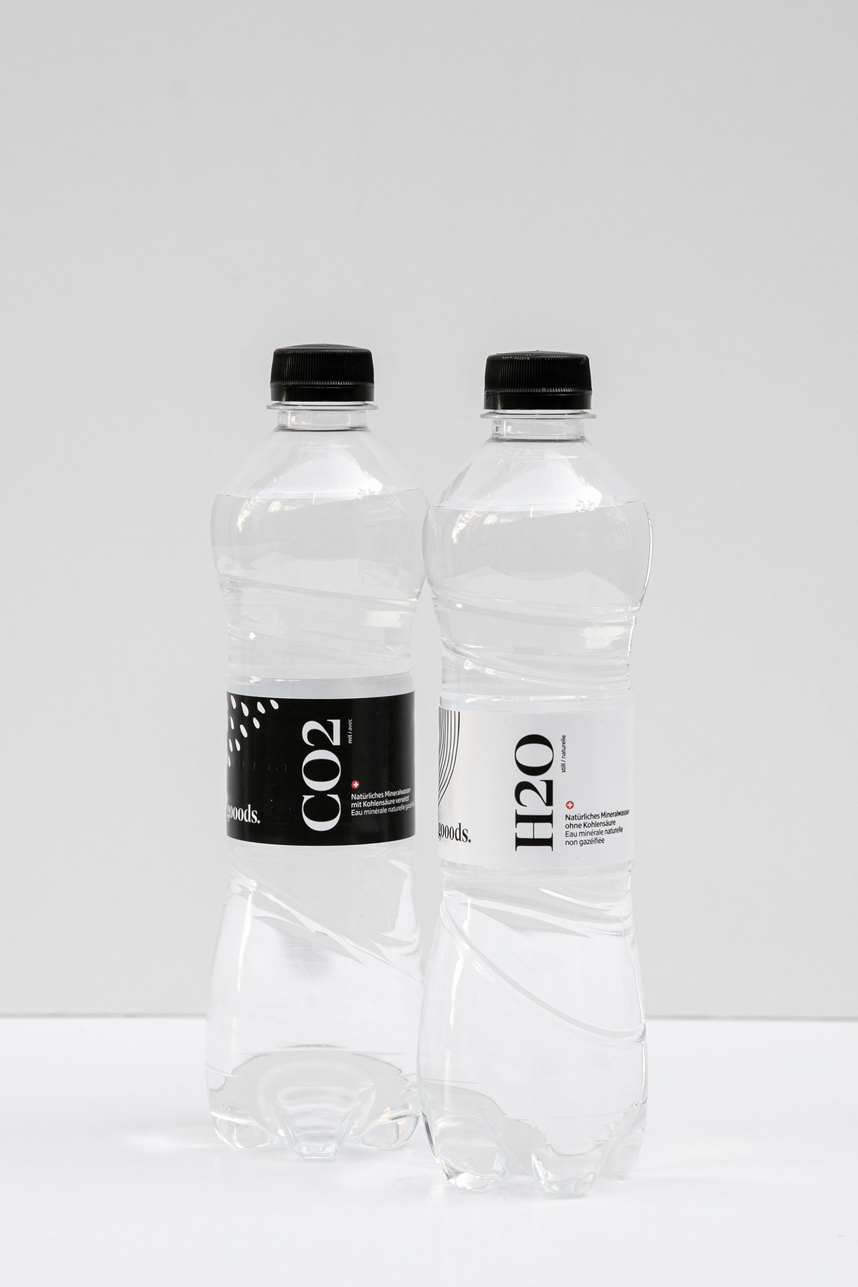
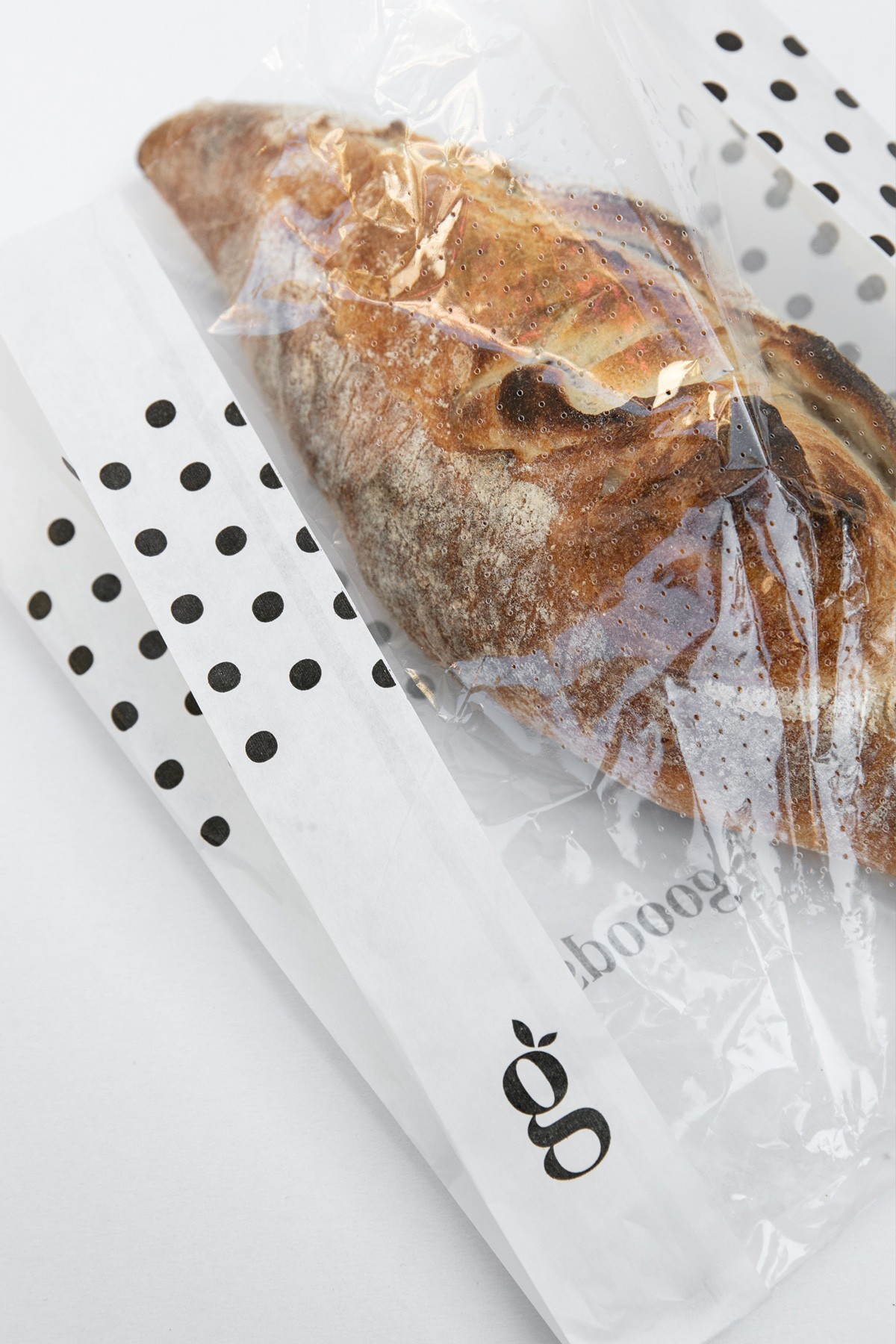
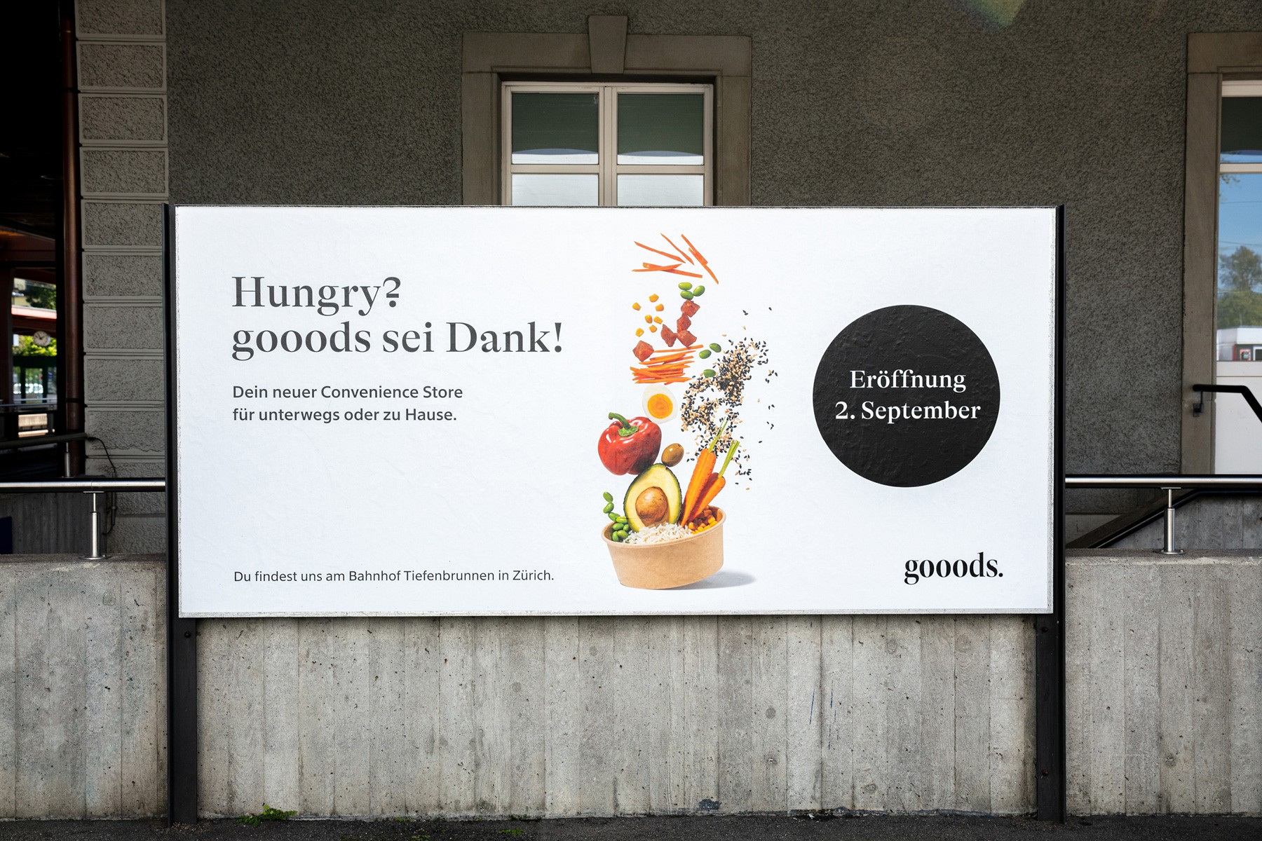
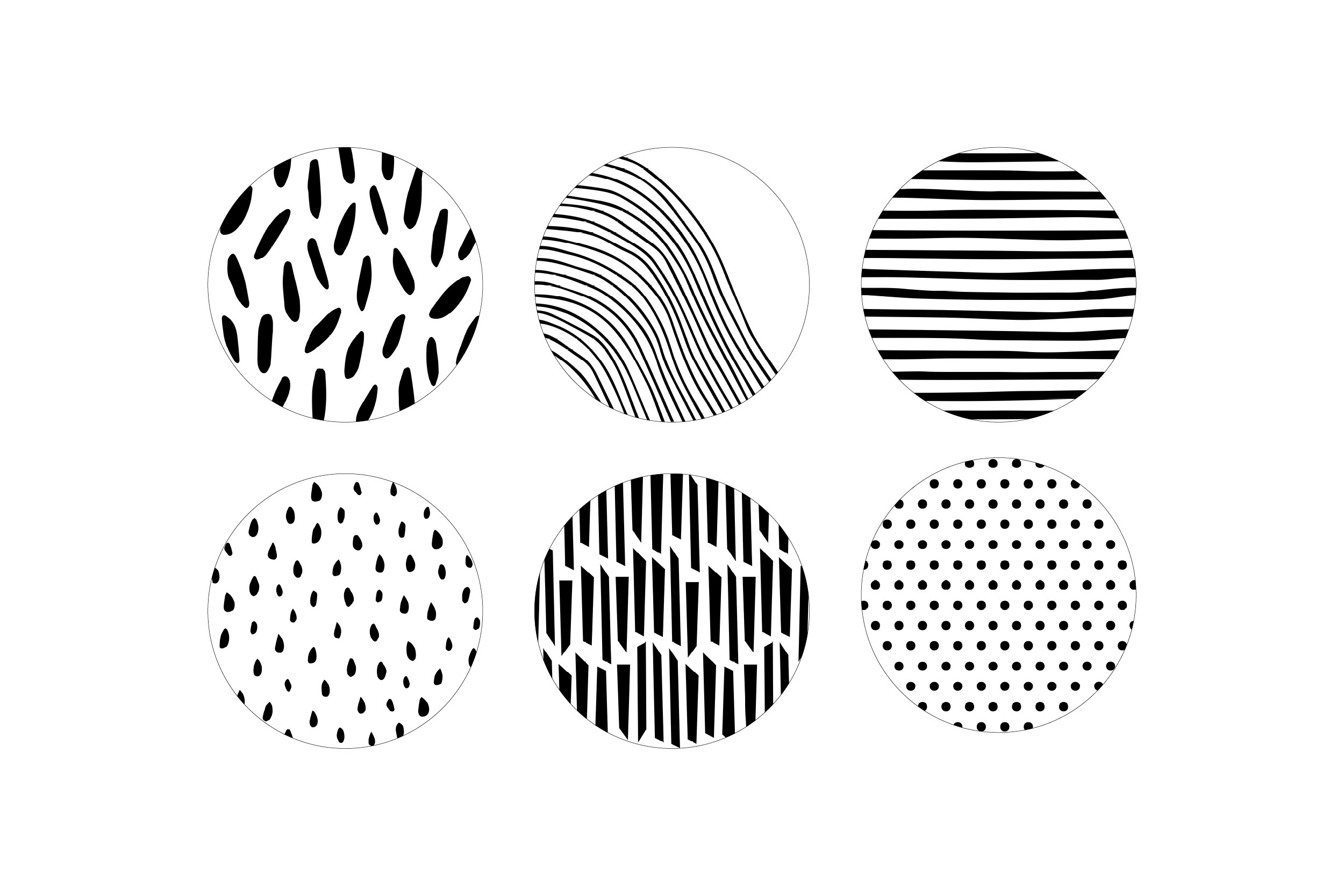
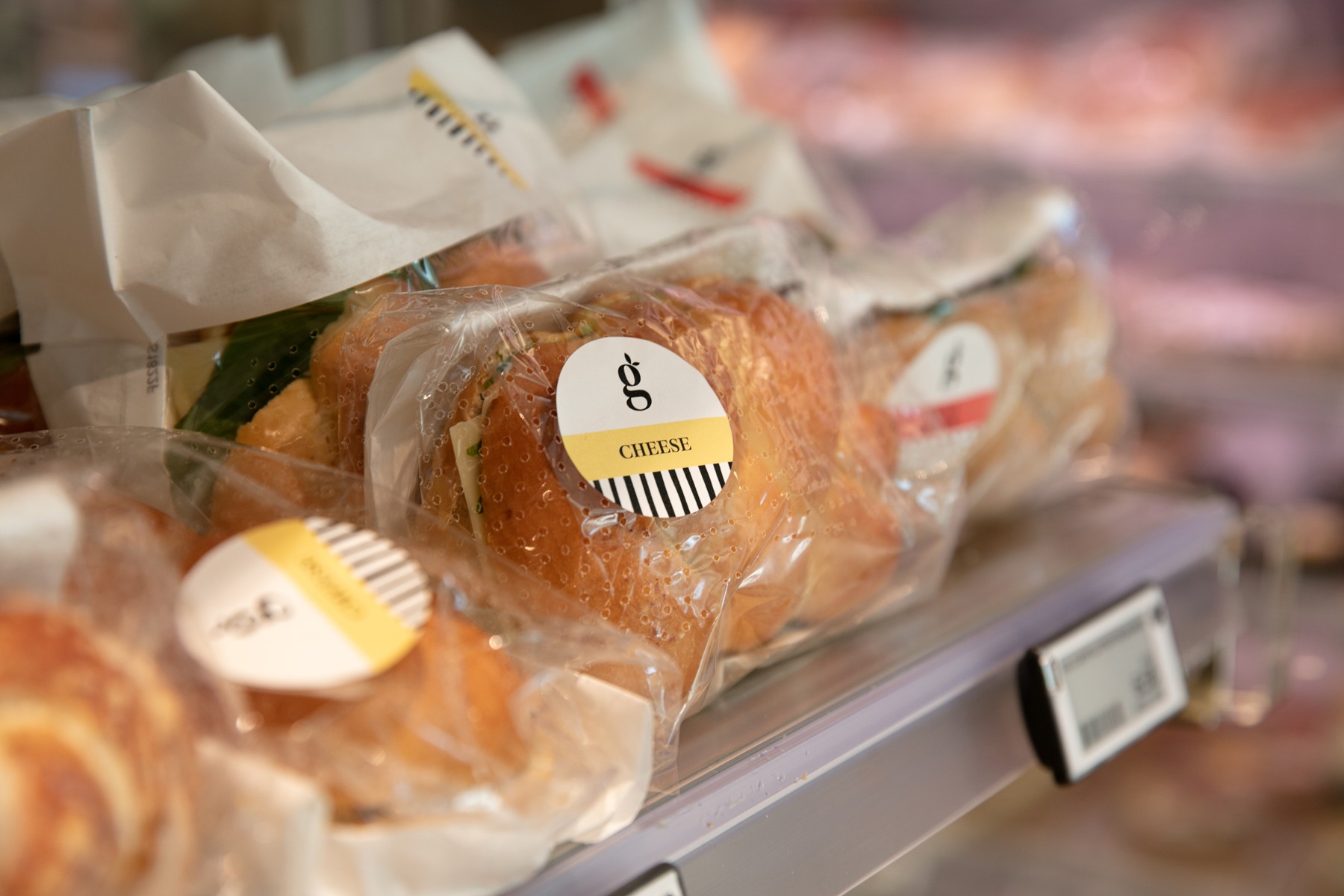
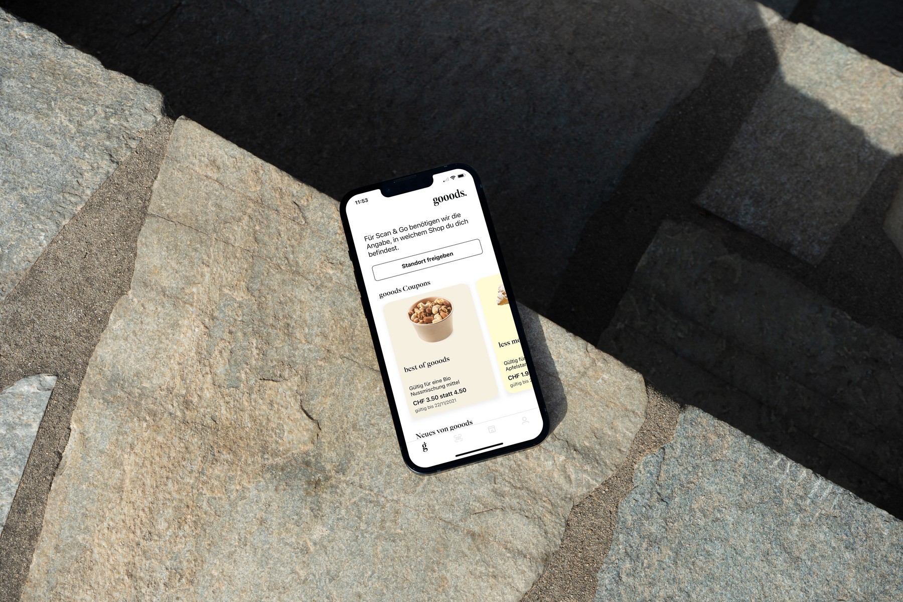
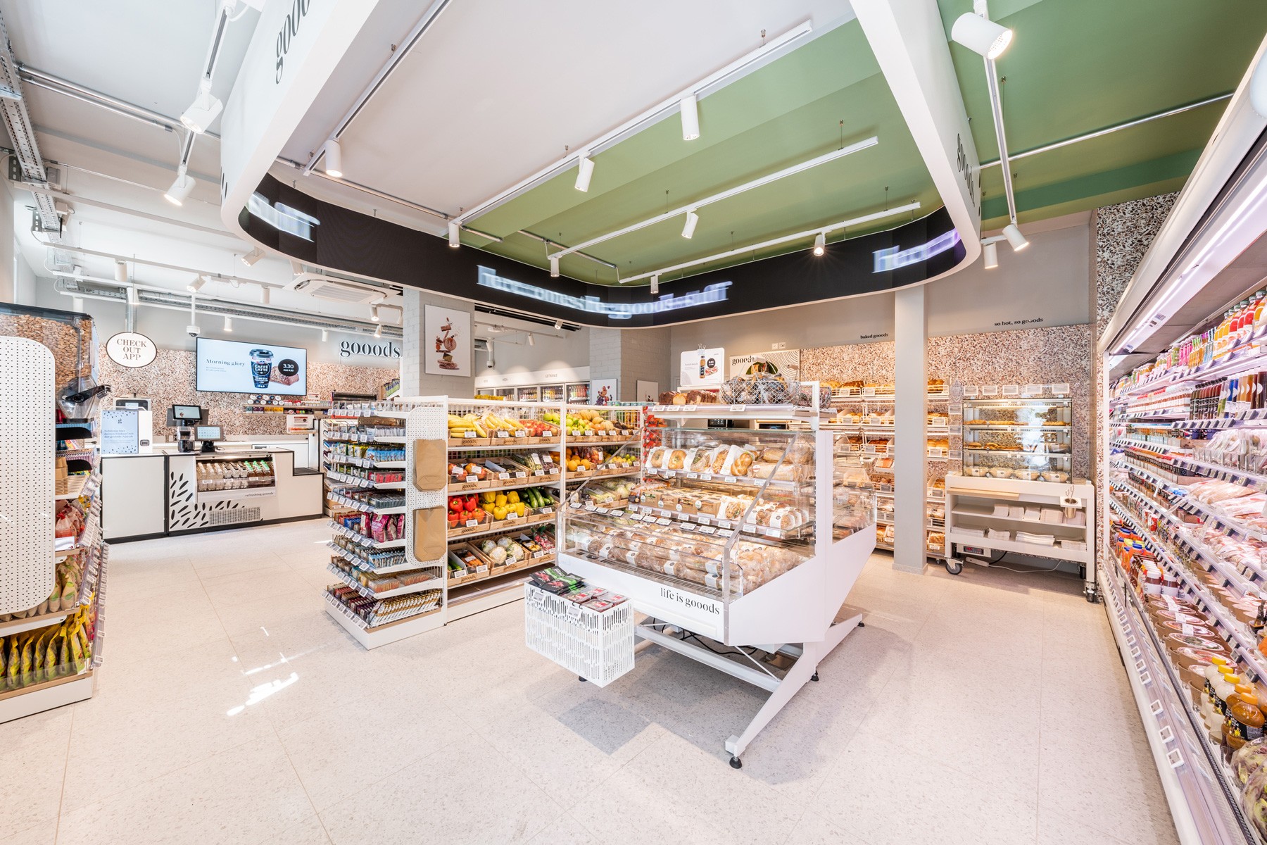
The idea for the naming was clear, to describe a carefully selected assortment of high-quality products and fresh handmade gooods. The minimal black and white branding concept puts the focus on the products and promises a comprehensive shopping experience with playful patterns and copywriting. The serif logotype is elegant, modern, and yet timeless. The dot at the end of the logo points out no compromise with the quality and freshness of the products. Inspired by the inner parts of fruits and vegetables, six unique patterns were designed to underline the store concept. They are extended to packaging, promotional materials like posters, in-store signage and interior furniture. The idea behind the image concept was to communicate the main product sections in the store by creatively piling the food on top of each other. In addition to creating the concept, we provided the art direction of the photoshoot and image editing. The modern web design gives a clear overview of the store concept, offered products and latest news.
